APP UI
I designed the UI of an HTML-based magazine app (for Dialect).
Below are designs for a magazine app built primarily in HTML, so that it can be viewable to the largest audiences (read: screen types/sizes) as possible, while still having the benefits associated with an app.
Also, it's an attempt at addressing the editorial desire to elegantly serve readers both "bundles" (like issues of a magazine), and "streams" (an ever-updating news feed).
A “Home” page with magazine issues ("bundles") and a news feed ("streams").
01

Banner heights are flexible, and banners are live (linkable).
02

Menu location is easy on the thumbs.
03

Tap it, and the menu affordance changes when open.
04

Accordion categories (and scroll), allow the menu to grow if necessary. (useful for phones)
05

Tap outside menu area (or menu button) to close it.
06

Readers browse left-right through issues, reinforcing horizontal interactions for magazine (bundled) content...
07

...or can scroll up to reveal news, reinforcing vertical interactions for temporal streams.
08

A “News” bar (with refresh affordance) pins to top, as posts scroll under.
09

If a reader selects a news post, it animates in vertically.
10

News posts are a standardized template with limited CMS options by design.
11

Readers can add posts to favorites, share via native calls, or close via a back affordance.
12

So goes the stream.
For magazines, a reader must download an issue.
13

Downloading telegraphs that what follows may be a different experience, & allows for other benefits including offline reading.
14

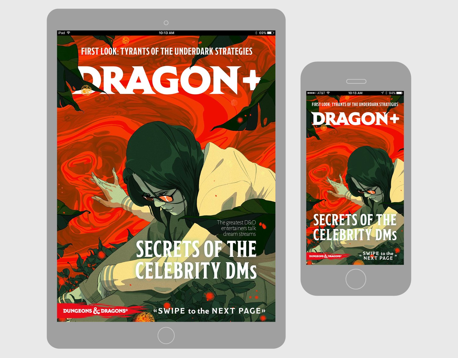
After it downloads, there is a familiar magazine cover image (animating in horizontally) with text, and a call to action to swipe horizontally.
15

Magazine posts are a non-standard template, with flexible CMS options for design.
16

Where the text block begins can be varied, & headline/body font & size are completely flexible.
17

Unlike temporal stream posts (News), magazine nav elements are only brought in with an interaction: tap any inactive area.
18

In magazines, horizontal interactions are the norm: a page scrubber reminds readers that pages exist to either side.
19

Magazine issues are not temporal streams: they have a context, and an end.
20

The affordance for exit is a “close” icon rather than a web-like “back” icon, like news posts.
21


An example of this was the long running Dragon+ magazine for Dungeons & Dragons.